© Karel Calitz 2026
October 27, 2025
Every Visitor is a Tourist: Accessibility Lessons from Finland
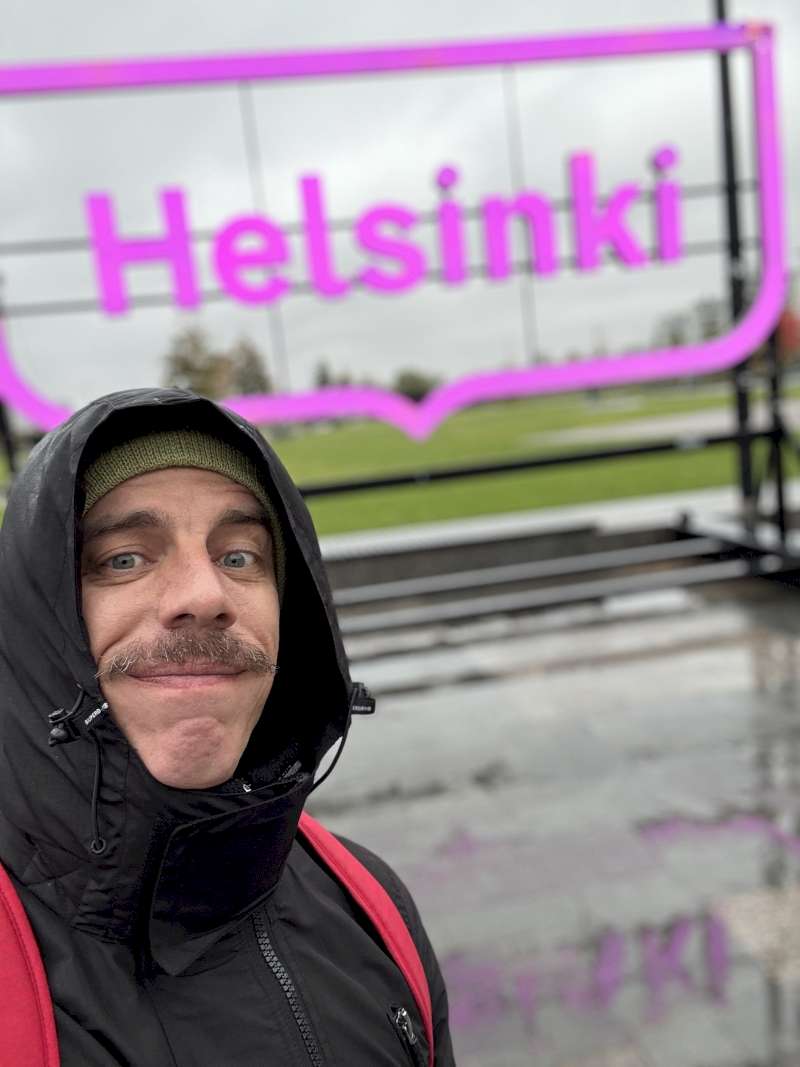
Earlier this month, I had the privilege of attending Ploneconf 2025 in Jyväskylä, Finland: a wonderful gathering of minds focused on learning together, sharing knowledge, and pushing the boundaries of what we can build on the web.
Every Visitor is a Tourist: Accessibility Lessons from Finland
The conference featured numerous excellent talks, with a particularly strong focus on accessibility this year. It was gratifying to see how well the sessions from the Juizi team were received once again, and Alex and I enjoyed adding some South African flavour to the conversations, leading to some great discussions with attendees after our sessions. (I'll be posting our talks as soon as they're made available by the organisers)
But this article isn't really about the conference itself. It's about what happened between the talks, about getting lost and found again, about apps that became my best friends, and about how the experience of navigating a foreign city taught me something profound about accessibility on the web.
When apps become your compass
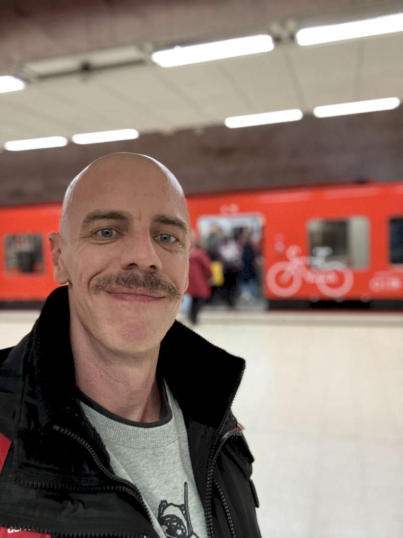
Helsinki impressed me with something unexpected: not just their legendary public transportation system, but the thoughtful digital ecosystem that powers it. I downloaded the VR app for railways, the Viking Line app for my ferry to Tallinn, Estonia, and the HSL app for Helsinki's tram and metro network.
Within days, Helsinki transformed from an intimidating foreign city into a place that felt navigable, almost familiar. The apps made it effortless to compare train times, visualize routes, and pay for everything. Once you figure out a city's transportation system, something magical happens. Distances feel shorter because you're no longer worried about getting there. I managed to visit different cities, cross into another country, and explore various neighborhoods with confidence.
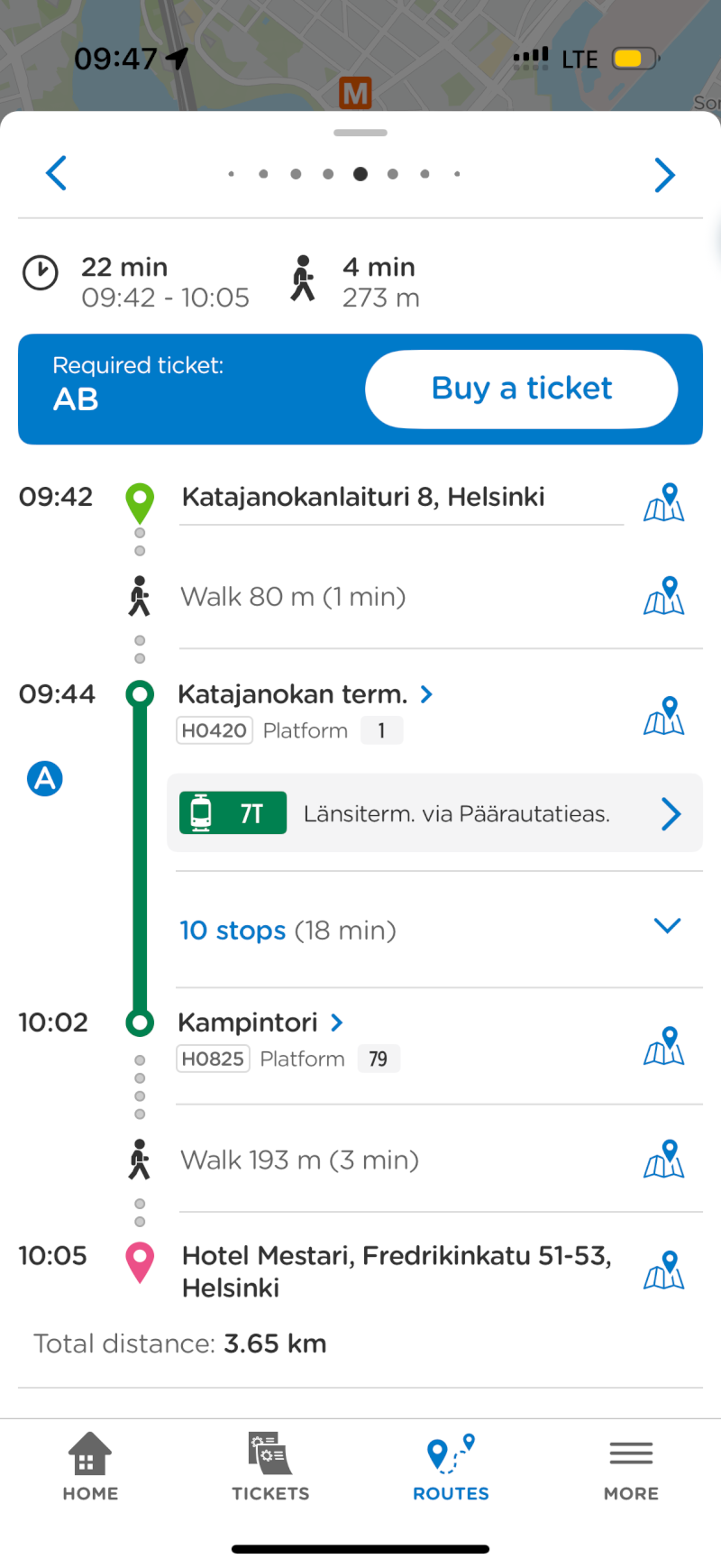
Well, mostly. There was that one overly-excited moment when I jumped onto the wrong train. But here's the thing: it was an easy fix. A few taps, a quick route recalculation, and I was sorted. We don't always get it right the first time, whether we're navigating public transport or designing websites, but good systems make recovery simple.
Your website is someone's Helsinki
This experience got me thinking about websites and accessibility through a different lens. Every visitor to your website is, in a sense, a tourist. They're arriving in unfamiliar territory, trying to figure out how to get where they want to go. Some are first-time visitors; others might be returning but looking for something new. Some are traveling with assistive technologies: their own version of translation apps or mobility aids.
The question is: are you giving them the tools to navigate confidently, or are you leaving them stranded at the station?
Good accessibility is like those Finnish transport apps. It doesn't just make your website usable, it transforms the experience from anxious and effortful into confident and enjoyable. It turns your digital space from somewhere intimidating into somewhere that feels navigable, even welcoming.
3 Ways to make your website more navigable
Looking at your website through the eyes of a tourist (someone who doesn't know the layout, hasn't memorized the navigation, and might be using different tools to get around), here are three things that can dramatically improve the journey:
1. Tell visitors where they are
Imagine arriving at Helsinki Central Station to find that none of the platforms were labeled. That's what navigating a website without proper heading hierarchy feels like for screen reader users.
Every page should have a clear H1 heading that tells visitors where they are, followed by H2s for major sections, H3s for subsections, and so on. Don't skip levels (don't jump from H1 to H4), and don't choose headings based on how they look. That's what CSS is for. Screen reader users navigate by jumping between headings, just like I used those transport apps to jump between stations. Make sure your headings actually describe the destination.
2. Multiple routes to the same destination
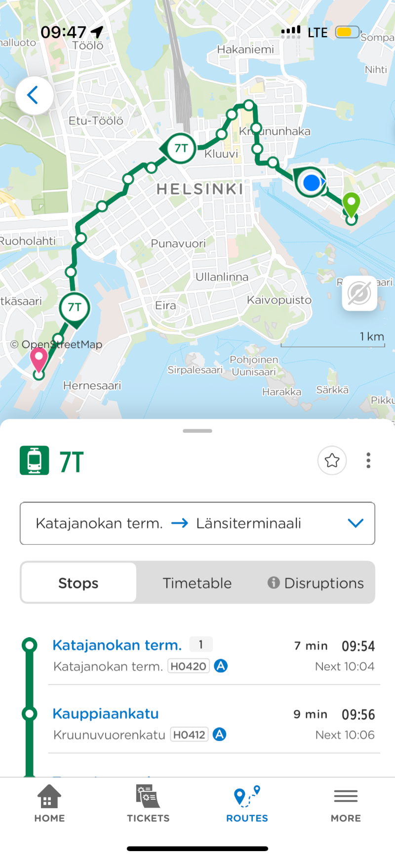
On the Helsinki metro, I could navigate by line number, by destination name, by route map, or by using the app's search. Multiple ways to accomplish the same goal.
Your website should work the same way. Offer a clear main navigation menu. Provide a search function. Include breadcrumbs so people know where they are in your site hierarchy. Add a sitemap. Consider a skip-to-content link for keyboard users. Not everyone navigates the same way, and that's fine. The goal is ensuring everyone can find what they're looking for using the method that works best for them.
3. Semantic HTML and ARIA: The technical infrastructure that makes it all work
Just as Helsinki's transport system relies on sophisticated infrastructure (ticket systems, real-time tracking, coordinated schedules), accessible websites rely on proper semantic HTML and ARIA (Accessible Rich Internet Applications) attributes.
Use semantic elements like <nav>, <main>, <article>, and <aside> instead of generic <div> tags. These communicate structure and meaning to assistive technologies. When building interactive components like dropdown menus, modals, or tabs, implement proper ARIA roles, states, and properties. For example, a button that opens a menu should have aria-expanded="false" when closed and aria-expanded="true" when open.
Think of semantic HTML and ARIA as the behind-the-scenes signaling system that keeps trains running on time. Users might not see it directly, but its absence creates chaos.
The memory of the journey
Here's what struck me most about my Finnish adventure: I remember it fondly because the accessibility of the transportation system let me focus on the experience itself. The conferences, the conversations, the architecture, the ferry ride across the Baltic, the charm of Tallinn's Old Town.
When your website is accessible, you're giving visitors the same gift. You're letting them focus on your content, your products, your message, rather than wrestling with navigation or giving up because their screen reader can't make sense of your structure. It's about creating experiences that people remember for the right reasons.
Getting Started
If you're wondering where to begin with accessibility, start where I started in Helsinki: with the basics. Download your first app: learn about proper heading structure. Figure out the main transit routes and ensure keyboard navigation works throughout your site. Get comfortable with one system before adding the next.
And remember: every improvement you make doesn't just help one person, it helps everyone. Better navigation benefits people using screen readers, people with motor disabilities using only keyboards, people with cognitive differences who appreciate clear structure, and yes, even people just trying to use your site on a phone while walking through an unfamiliar city.
The journey to accessibility, like my journey through Finland, isn't about perfection. It's about making thoughtful decisions that help people find their way. Start today, and watch how it transforms not just your website, but the experiences of everyone who visits.