© Karel Calitz 2026
March 27, 2026
A Whole New World … But Now I Suddenly Need a Map
I got sucked into a Disney vortex this morning. Not intentionally. It just happened the way these things do. One song leads to another, and suddenly you're forty-five minutes deep into the live-action remakes, wondering where the morning went.
Jasmine and Aladdin, singing about a whole new world, every turn a surprise, every moment red-letter. Except not really. It sounded right. It looked expensive. But it felt like karaoke: technically on key, emotionally in a completely different building.
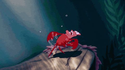
Sebastian, doing his level best under the sea. The animation had given him a whole ecosystem to conduct: fish in formation, every bubble choreographed, colour and movement doing half the work for him. In the live-action version, you get more-or-less realistic ocean and a crab. Dancing is harder when the ocean is, well, the ocean.
And then there's Belle, bravely attempting to carry Be Our Guest without quite having the voice for it, the autotune working overtime like a very polite sound engineer who's pretending everything is fine.
There's something genuinely interesting happening here, and it's not just that the remakes are bad (though some of them really are). It's why they don't land.
The Problem Isn't the Story. It's the Translation.
Disney didn't rewrite the plots. Ariel still wants legs. Simba still has to reckon with his past. Aladdin still has three wishes and a complicated relationship with the truth. The bones are intact. What's missing is harder to name.
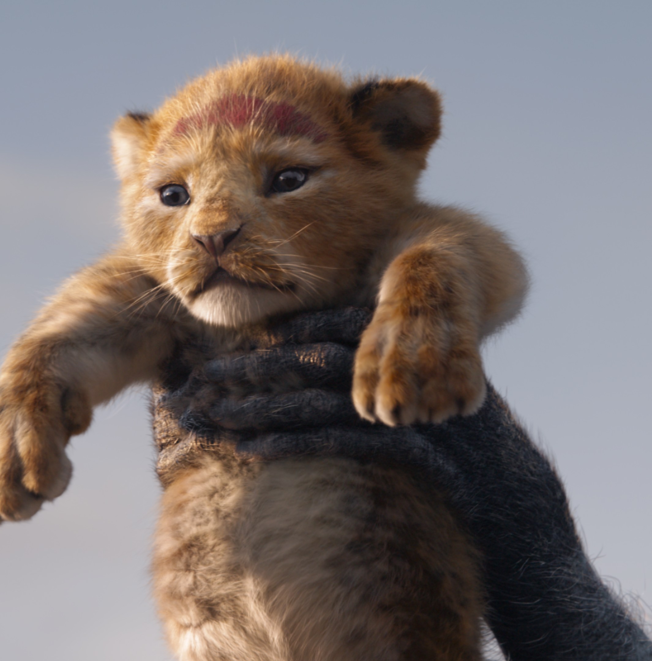
The Lion King remake is a useful case study because it's almost aggressively faithful to the original: same story, same songs, same structure. The technology is genuinely impressive. The animals look like animals. And that's exactly the problem. Animals don't grieve expressively in real life, which means that when Simba stands over Mufasa, you don't believe for a second that this CG cub is devastated. The original scene overflows with heartbreak in every frame.
They chose visual realism and lost emotional realism. The upgrade became a downgrade.
The same thing happened to King Louie in The Jungle Book. In the original, I Wan'na Be Like You is pure joyful chaos: a big personality in a body that can swing and shimmy and get right up in Mowgli's face. In the remake, they made Louie anatomically correct (a gigantopithecus rather than an orangutan, because orangutans aren't native to India; sure, fine, points for accuracy). The result: confined to one corner, barely moving, the jazzy number goes completely flat. They solved a problem nobody had, and created one that nobody wanted.
And Beauty and the Beast added backstory: Belle's mother, the Beast's childhood, more context, more depth. They filled in gaps that the audience's imagination was happily filling in on its own.
The pattern is consistent: each remake tried to fix something, make it more realistic, more accurate, more thorough, and in doing so, broke something that was working perfectly.
Websites Do This Too
I think about this a lot with website redesigns. Maybe because I've been part of enough of them to have seen the pattern repeat.

An organisation decides it's time for a refresh. The site is five years old. It looks a bit tired. Someone on the board says it doesn't feel modern. So they commission a redesign: new visual identity, reorganised navigation, updated information architecture. The result is clean, contemporary, professionally produced.
And then visitors get lost.
The content they used to find easily has moved. The navigation works differently. Pages they bookmarked redirect somewhere unexpected. The site looks better by almost every visual measure, and yet something has been lost in translation that's hard to articulate. The rhythm is gone, that sense of knowing where you are and where to go next that visitors had quietly built up over years of using the old site.
They redesigned the site. They forgot to redesign the journey.
This is the Lion King problem. Replace the expressive animation with photorealistic CGI, and you've technically upgraded everything while emotionally downgrading the thing that mattered most. Replace a navigation structure your users have learned with one that makes more logical sense on a whiteboard, and you've technically improved the organisation while practically making everyone feel a bit lost.
The Specific Pitfalls
Disney's mistakes map surprisingly well onto the common ways redesigns go wrong.
Fixing things that weren't broken. The gigantopithecus problem. You find something technically imprecise in the original and correct it: more accurate, more logical. But the imprecision was load-bearing. It was doing something. Your visitors developed habits around that quirk, and now those habits are wrong. Accuracy without care for function is its own kind of error.
Mistaking visual upgrade for genuine improvement. The Lion King looked astonishing. Technically, it's a marvel. But technology fades over time. The original's raw emotion and hand-drawn artistry won't. A site can look polished and modern and still be harder to use than what it replaced. Visual freshness and functional improvement are not the same thing.
Adding content to fill gaps the audience wasn't feeling. Belle's dead mother. The Beast's childhood trauma. More information, more depth, more context, but context the audience didn't need because they'd already filled it in themselves. In redesign terms: adding sections, pages, and explanatory copy to areas that users were navigating confidently. Adding more doesn't always add more.
Losing what made the original work in its original medium. Sebastian conducting an animated orchestra is magical precisely because animation can do things live action cannot. Similarly, a website that worked beautifully in 2018 worked partly because of how people were using the internet in 2018, the conventions they understood, the patterns they recognised. A redesign that starts from zero often throws out that accumulated knowledge along with the outdated design. You can't replace what something was with what something looks like.
What the Good Remakes Did Differently
Not all of Disney's remakes failed. A few landed well, and it's instructive to see why.
Maleficent worked because it didn't try to replicate the original. It approached the same story from a completely different angle, asking a question the original never answered: what was her perspective? Familiar material as a foundation, something genuinely new built on top.
The 2016 Jungle Book worked because (despite the photorealistic animals) it leaned into the wonder of Mowgli's world rather than the accuracy of the jungle. The question wasn't how do we make this more real? It was how do we make this feel bigger?
Both started by asking what they wanted to do, not what they wanted to update.
The best website redesigns work the same way. They don't start with "our site looks old." They start with "our visitors arrive looking for X and we're not giving it to them" or "we want people to feel Y, and the current site creates feeling Z." The visual refresh is in service of an answer, not a question.
The Real Work
Before a redesign, the question worth asking isn't what needs to change. It's what is actually working, and for whom?
Where do visitors naturally move? What information feels easy to find? What journey have they learned, and what would it cost them to unlearn it?
A good redesign doesn't start with design. It starts with understanding what the current experience is doing: the good parts, the broken parts, the parts that look like problems but are actually features. Keep the rhythm that works. Improve the parts that don't serve it. Test before you launch.
Disney had the songs. Disney had the budget. Disney had the IP, the nostalgia, the goodwill of generations of fans. And they still managed to lose the magic by upgrading everything except the things that mattered.
The whole new world is lovely to look at. But if your visitors are standing in it wondering where they are, that's not a journey. That's just a very expensive map that didn't come with a legend.
That's the real work: make sure the map still makes sense.